Background
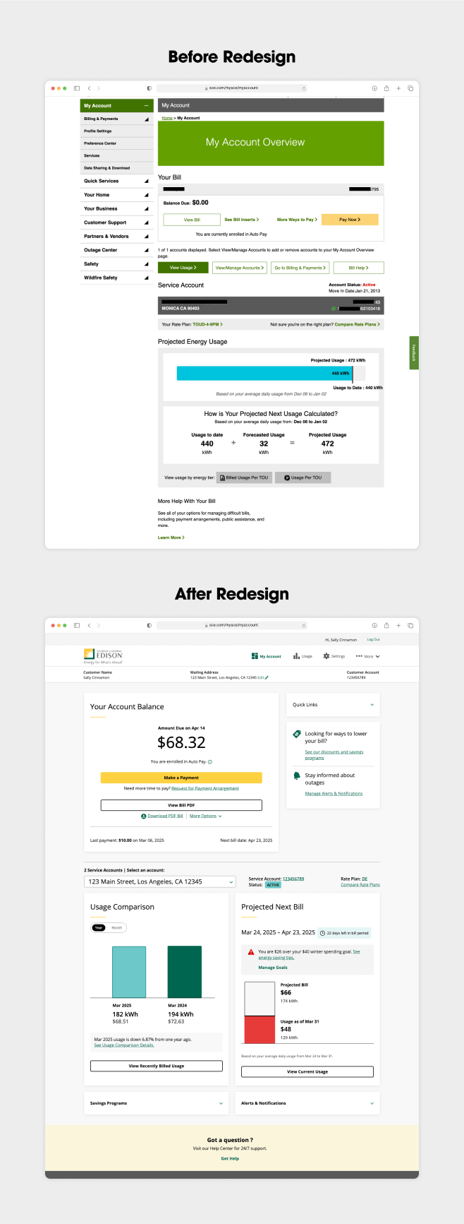
The SCE My Account dashboard is the primary customer touchpoint for most visitors to Southern California Edison’s website. Users log in to My Account to pay their bills online, monitor electricity usage, set alerts and preferences, and manage a range of other account details.
Challenge
SCE wanted to provide an easier self-service experience for its customers. This meant strengthening My Account’s page functionality to enhance ease-of-use, refreshing content to conform to updated brand style guidelines and accessibility standards, as well as supplying a whole new look and feel. In short, we understood the scope of our challenge to include balancing My Account’s business, page functionality, and customer experience goals simultaneously.
Insights
After SCE customer feedback identified the most valued functions on the My Account dashboard, RPA and SCE teams mobilized quickly, applying fresh insights for a reimagined customer experience that prioritized high-value actions:Together with SCE, our Analytics and Insights team reviewed data to develop recommendations about which action components could be deprioritized, retained, and/or enhanced.Our Product Strategy team evaluated multiple dashboards from best-in-class brands and businesses to determine a baseline for industry standards and functional excellence. In turn, SCE guided our recommendations with detailed feedback about how best to implement these standards to fit customer needs.
Solutions
Refined Digital Design System
Building off existing brand guidelines, our Creative team applied a new look and feel promoting account management as a self-service experience. All page elements—headings, cards, icons, visual elements, and white space—work together to create a strong information hierarchy to guide customers smoothly through dense content while complying with Web Content Accessibility Guidelines (WCAG).
Charts & Graphs
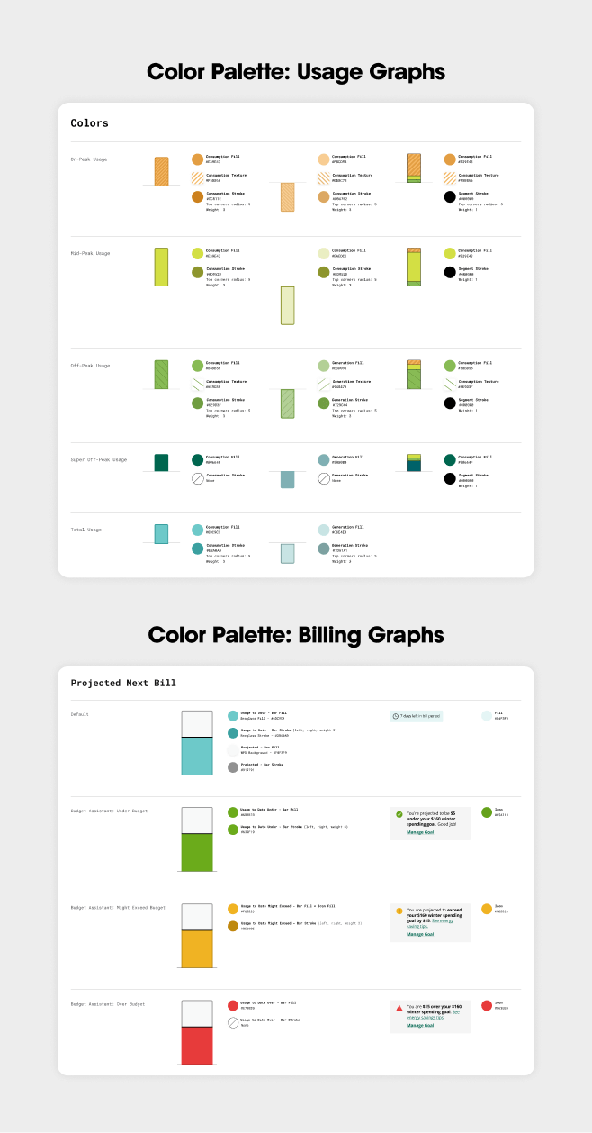
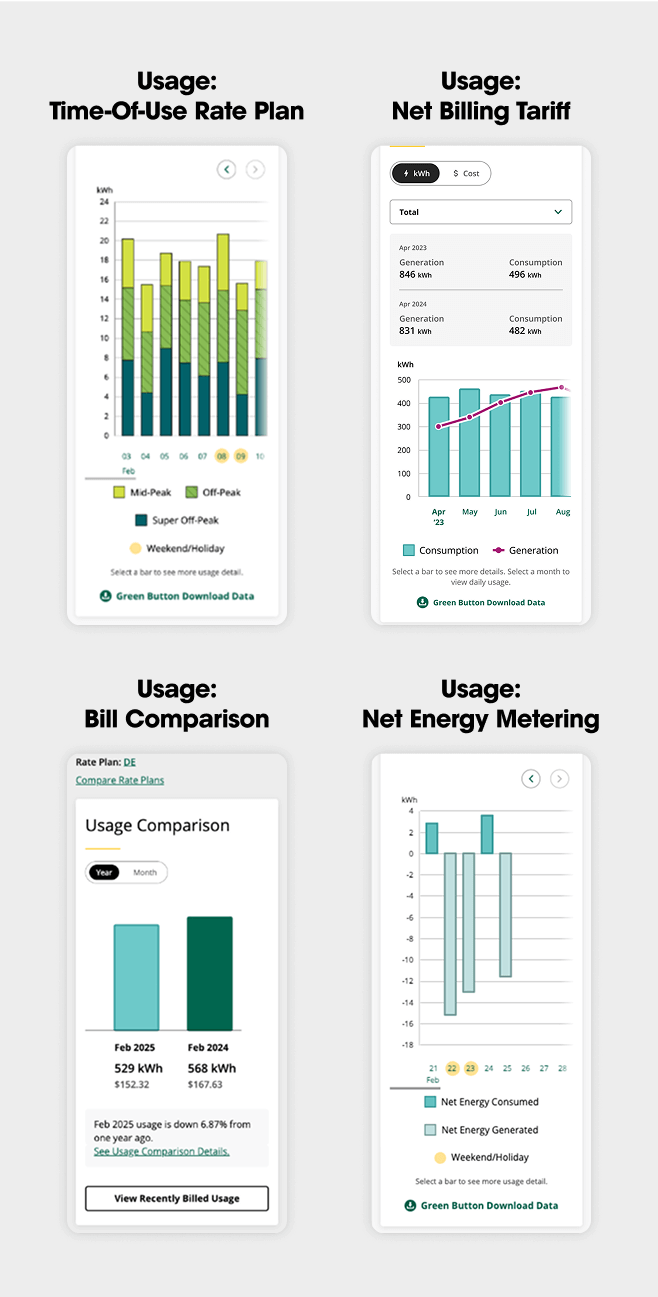
As identified by our UX/UI team, a range of customer rate plans (e.g., Time-Of-Use [TOU], Tiered, Solar) and usage views required urgent upgrades to promote user comprehension at a glance. Our Creative team expanded SCE’s color library to make graphs and charts accessible to customers on any rate plan and according to any usage view, whether by month/day/hour, for current or billed periods, or for special programs like Demand Response. In addition, for TOU customers, we introduced segmented bar graphs that allow them to quickly see usage by time of day.
Navigation and Mobile Solutions
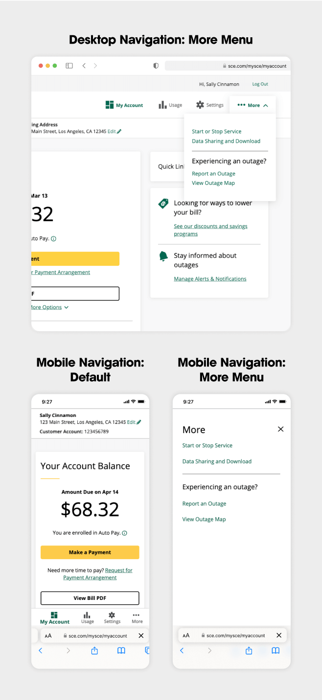
We simplified navigation pathways and used clear labels to let customers quickly access key account areas. We also made sure the experience works well on smaller screen sizes.
Personalized Dashboard
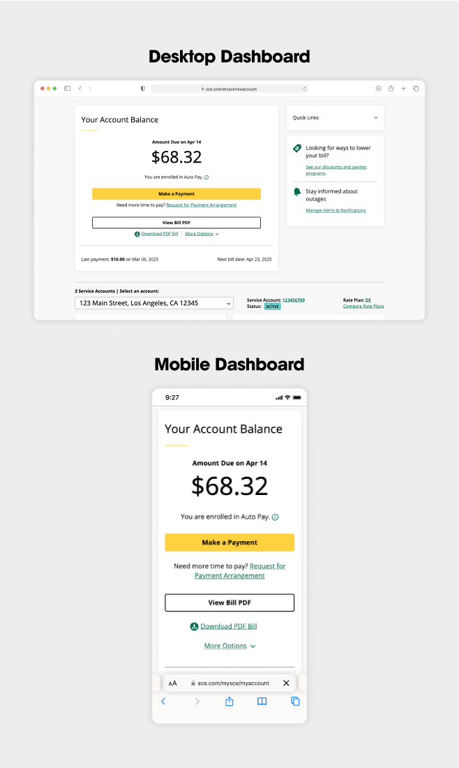
As the front door to the self-service experience, the dashboard’s first job is to make it intuitively simple for customers to accomplish high-priority tasks: managing their bill and checking electricity usage. The agency conceived a modular approach to present information in digestible pieces, making it easy for users to scan and process data even as it flexes to accommodate different customer scenarios.
Respectful Collaboration. Unmistakable Results.
Time and again, RPA’s deep roster of in-house subject-matter experts blended fluidly with those of our SCE counterparts to promote quick-turn solutions that accelerated delivery of the best possible experience for My Account users.
Quite simply, such cross-functional, multi-level collaboration is what we’re built for, and it’s what makes the My Account redesign project such a gratifying team win for client and agency both. We couldn’t be prouder.


